|
Jump to: Colours | Visuals | Layout | Tips | Accessibility | Hiring a designer
Before designing, you need to imagine how you want your poster to look. Always have your audience in mind when thinking the layout, every word and image you want to use.
Layout
What visual arrangement will suit your content best, and how will you lead the reader through it?
- Check how much space you will have to present your poster, and the standard size for leaflets where you will print it.
- An effective research poster should provide a clean and consistent layout which emphasizes the research results and utilizes purposeful graphics and visuals.
Types of visuals
There are many types of visuals to choose from; photos, icons, graphs, animation, for example. To determine the image, make sure it will attract attention from your key audience and will be able to be perceived positively, accurately, and informative. Ask yourself:
- Are the visuals interesting? Will it catch my audiences' eye?
- Will my audience be able to interpret the image?
- Is it telling a message or a good example?
- Is the resolution of the images correct for large printing? Use a minimum 300 dots per inch (dpi) when saving images. Avoid copying and pasting images from the web that are below 250kb for best results (TTU, 2007)
- Is It offensive, inaccurate, confusing or culturally innapropriate?
Hiring a designer
When developing a poster, designers and researchers will work together to reach their target audience by communicating a suitable scientific message coupled with achieving an accessible design.
The designer's role is to collaborate with the research team and discuss with them their needs, concerns, and present options throughout the design process to help shape the outcome. Allocate a contact liaison and regular meetings to work closely with the designer.
Colours
When using colors to bring things out and add visual interest to your poster, choose a palette carefully:
- Bright, bold reds and yellows - draw attention and energize your image
- Cooler blues, purples, and greens - bring stability, calm, professionalism
- Black and white contrasts - fantastic way to captivate and convey sophistication
Did you know colour is perceived differently according to the culture? Read more about this study.
Avoid colour combinations that do not meet an AA or AAA accessibility standards. Use the contrast checker tool or colour blindness simulator whilst creating your colour theme. See more on accessibility.
Tips
|
|
Do's
|
Dont's
|
|
Fonts
|
Sans-serif fonts such as Arial, Gill Sans, Helvetica, Roboto and Verdana
|
Serif fonts such as Times New Roman and Garamond, which are less legible.
|
|
Text size
|
bigger is better!
- Main title: 72 point (min) - 158 point (ideal)
- Section headings: 42 point (min) - 56 point (ideal)
- Body text: 24 point (min) - 36 point (ideal)
- Captions: 18 point (min) - 24 point (ideal)
|
|
|
Alignment
|
For English and other languages that are read from left to right, use "left justified" (a.k.a "left flush" or "left aligned") text.
|
"Fully justified" text which changes the space between letters and makes text harder to read.
|
|
Line spacing / line height
|
- Use 1.2 to 2.0 line spacing (1.4 or 1.5 ideal) for poster body text.
- Use line spacing of at least 2.0 between paragraphs.
|
|
Accessibility
When developing your communication posters, you should allow for a wider reach and accessibility beyond what we typically are concerned with which is open and free access. Make your poster ‘perceivable, operable, understandable and robust’.
Posters should:
- Be appropriate to the literacy of targeted population.
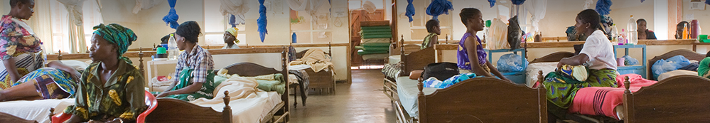
- Culturally suitable. If you use clipart of people for example, make sure that they match the context of the region/country where you are going to disseminate the poster. For example, check appropriate dress code according to your audience. Women in Kilifi Kenya wear skirts and not shorts.
- Fit the education level of the audience: Reserve the use of graphs with hard data to health professionals and researchers and avoid them for wider public.
- If you’re going to an exclusive scientific conference, you can use specific language, but if your poster will have a general audience, don’t use scientific/medical terminology! For example, don’t use malnutrition and instead use "very thin and not growing well", "sick children".
Beware of assumptions! Don’t assume all people from a certain cultural background share the same beliefs and ways of behaving.
For each poster, make sure to involve your communities and test/get feedback before releasing them. This might require more than one round of feedback.
|